 this one was fail x_x
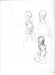 these were the final sketches
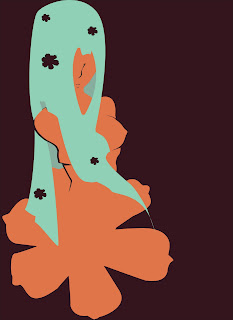 one of many versions lol
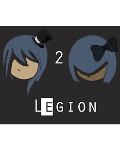 This one for my friend Yarineth.
I'm doing art! Say Whaaaaaaaaaaaat ;D
 this one was fail x_x
 these were the final sketches
 one of many versions lol
 This one for my friend Yarineth.
9 comments:
wow these are beautiful! I love the top one especially, and the 2nd from the top. Did you draw it in illustrator or scan a pic in?
Oooohh. I like these. I really like how representational design and non-rep collide in different places and I also like the lack of contour line. The flat shapes of color are nice, they remind me of, like, Bob's paintings or something.
AMAZING job. can definitely tell you know how to use the program really well. the third one down was not a 'fail' it was my favorite!
Looks like you've pretty much got illustrator on lock. Good job!
Some thing tells me you have done this before.
These are impressive! I like the more "grown-up" quality these have rather than what I am used to seeing from your work. My favorite are the ones with the swirls. Looks like you adjusted them a bit to get small results. I like!
These are....good. yes, good. Jealous much? i think i am. Albeit the last one is illustrator done, I dislike it. Banners can be done well with correct font styles and placement, joo know? yah.
oooOOOoo!! i like these, the first and second attract me more, your use of color is kewl and i like the ambiguous shapes behind the girls head one the first one.
@Josh Oh yeah I agree Josh, I've got some more ideas for the last one :D
@angelique: Thanks. I didn't use the swirl tool though. In most if not all of these, I used the pen tool, elipse tool, square tool, copy/paste, and gradient. Those are my favs.
@Emma: Really? I didn't like that one bc I couldn't think of a background for it lol
@Ck I haven't done designs before before this year, but I have taken 2 highschool photoshop classes (but we didn't do cool stuff in illustrator just pen tool practice if we did) and 1 course in my previous college where all we did was illustrator (still, no cool stuff. merely button learning).
@ Cypress: All of them are based in some way shape or form on a scanned in sketch that I then traced using the pen tool. Makes the pen tool easier to do what I want if I have a plan.
Post a Comment